Funded • Making funding accessible with user-centered design

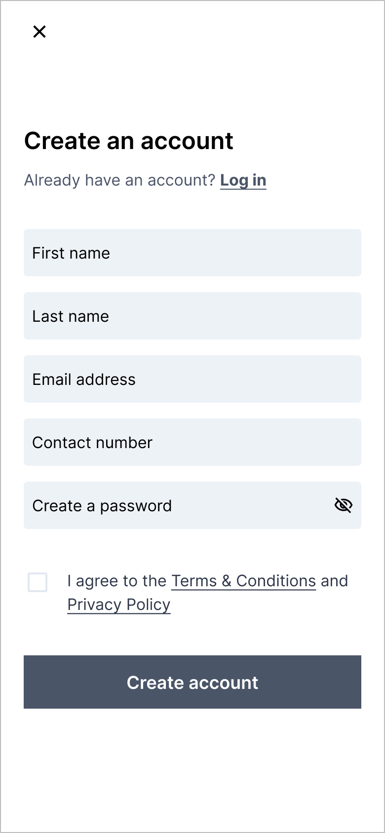
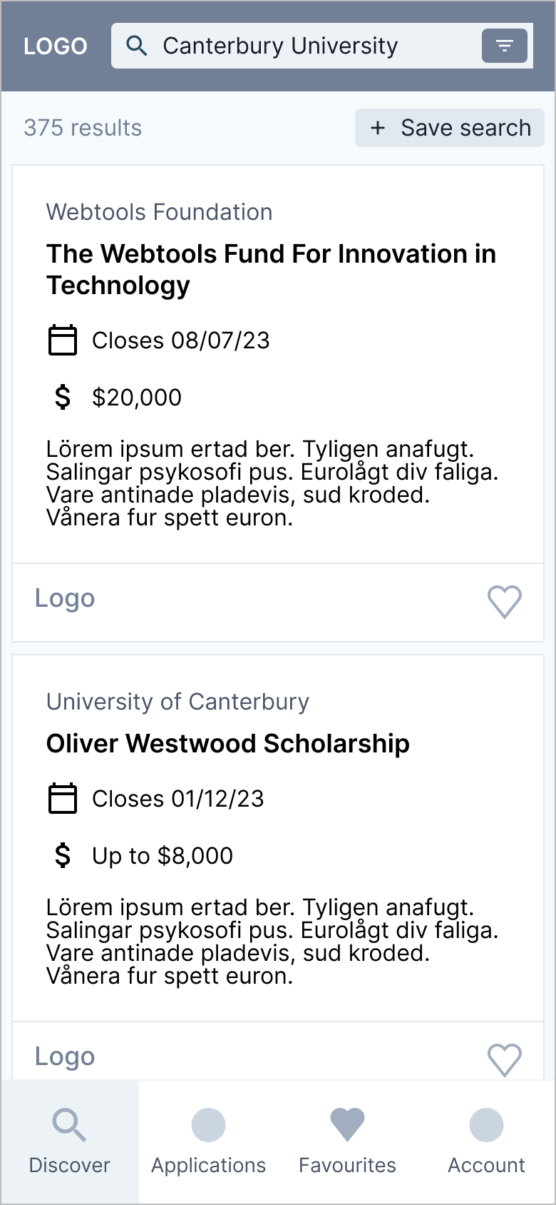
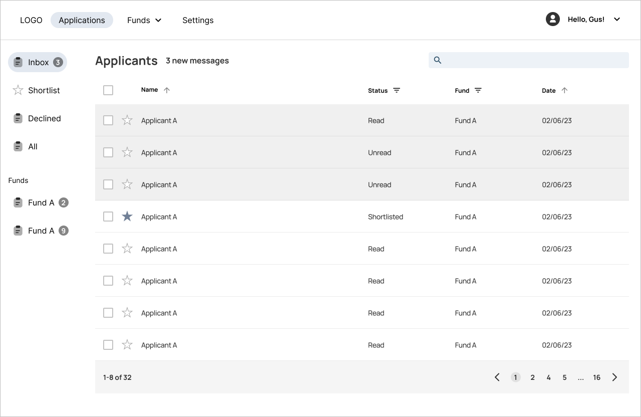
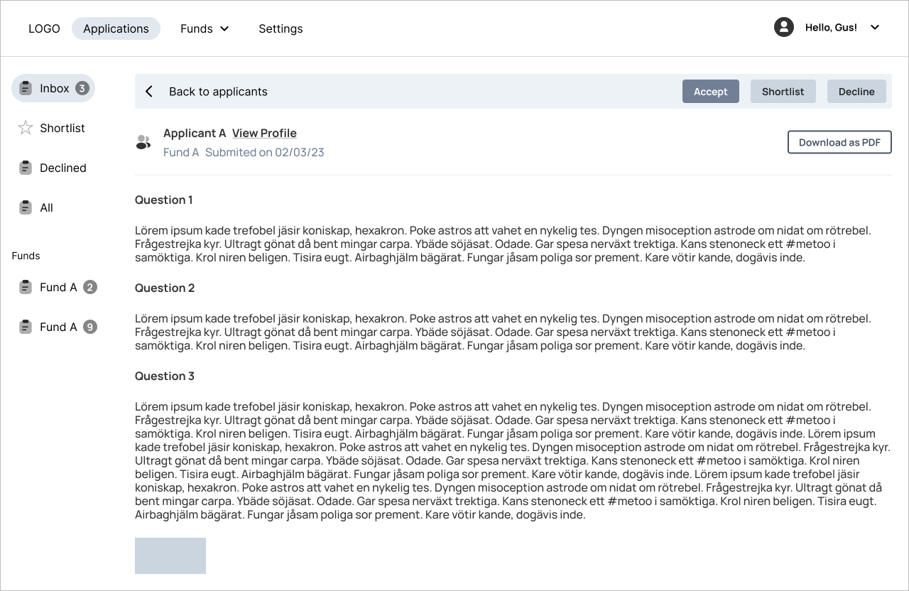
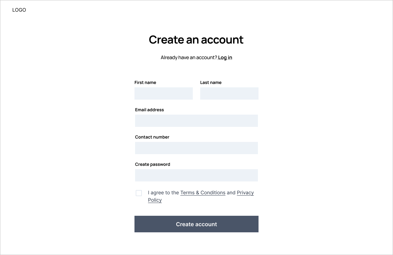
Funded is a platform that provides access to funding for a variety of purposes. Such as research, education, business ventures, and personal projects. Its mission is to empower individuals and organizations to pursue their goals by making it easy for anyone to find and secure funding.

I worked with Averill and Bonnie, the heads of Funded, to design a platform that supports the company's mission and values, while placing the user experience at the forefront.
Role • Lead UX/UI Designer
Duration • 3 Weeks
Tools • Figma

The Problem

Although there are countless funding opportunities, they are scattered across different sources, resulting in funds going unclaimed and many individuals and organizations unable to access the resources needed to pursue their initiatives. The fragmentation also makes it difficult for users to find and compare funding opportunities.
01
Research
02
Define
03
Ideate
04
Design

01

Research

Talking to Averill and Bonnie

We began the project with a whiteboard session, where we discussed the business goals and values, and aligned them with the user needs. We sketched out the essential pages and brainstormed the essential and optional features to include on each page. This meeting helped us create a user-centric solution that aligned with Averill and Bonnie’s vision.

User Personas

Averill and Bonnie conducted user interviews before approaching us with their project. Using the insights gathered, we crafted two distinct user personas - one for individuals seeking funding and another for individuals offering funding.

The Student

Sarah is a 27-year old graduate student pursuing a degree in environmental science. She is passionate about sustainability and is eager to find funding opportunities to support her research. Sarah is tech-savvy and values user-friendly platforms.

Wants

  • Find funding that is relevant and up-to-date
  • Track the status of her application progress.

Frustrations

  • Spends a lot of time searching across different platforms.
  • Finds the application process confusing.

The Philanthropist

Joanna is a 55-year old philanthropist who is passionate about supporting education and research initiatives. She is looking for a platform that can connect her with innovative and impactful projects to fund. She values a user-friendly platform that allows her to connect with eligible candidates.

Wants

  • User-friendly platform that makes it easy to manage applications.

Frustrations

  • Receives funding requests that are not eligible.

02

Define

Defining the product

I collaborated with Averill and Bonnie to develop the product architecture taking into consideration the end-users needs and the Funded teams objectives. On a whiteboard, we created a visualization of the product pages and user flow and compiled a comprehensive list of features. This helped us to gain a clear understanding of the product's functionality and what features to prioritize. 

There would be two interfaces, one for users looking for funding (who we nicknamed ‘fundees’) and another for users advertising funding (‘funder’). To showcase both mobile and desktop, the fundee interface would be mobile and the funder interface would be desktop.

Mobile

Page
Action

Desktop

Page
Action

03

Ideate

After the product structure was clear, I translated the designs into wireframes and checked them against the research. I then went over the designs with Bonnie and Averill to get the green light from them.

Wireframes

04

Design

We used teal green as our primary color, paired with a bold pink for call-to-action buttons. The minimalistic design, featuring ample white space, prioritized readability for the text-heavy content. Our goal was to create a fun and approachable aesthetic, avoiding a corporate feel.

Hi-Fi Designs

Onboarding

Our app requires personal details from the user to offer a personalized experience and avoid ineligible fund applications. This process can be lengthy, so to make the onboarding process user-friendly, we split it into sections and allow users to skip it to access the dashboard. However, most features are locked until they create an account, which incentivizes them to do so. This approach encourages user engagement and simplifies the onboarding process.

Dashboard

Users are presented with a hierarchy of call-to-actions, such as searching for funds, continuing previous searches, viewing recommendations, continuing applications, and completing their profile.

Discover

For account holders, their discovery page is tailored to display funds they are eligible for by default. Users can modify this through search filters, clear all filters, reset to personalized filters, and save their searches. Users are presented with essential funds details and can choose to view more or add it to their favourites.

Applications

Users can access all their applications on this page, with incomplete applications at the top as the main call-to-action. The status of each submitted application is shown as pending, accepted, or declined.

Funds

Users can view all fund information by selecting a fund. Eligibility requirements are displayed with either a green tick or a question mark based on user details, simplifying the process. Users can apply or save funds to favourites from this page.

Profile

Users can create a public profile with all desired information and social links for funders to view.

Onboarding

Similar to the Fundee interface, the onboarding process for this interface also requires a lot of details for verification purposes. Although mandatory, we collect less information which keeps the process brief. Users create an account, select the situation that best describes them, and provide necessary details based on their selection.

Dashboard

Upon login, users land on a landing page displaying an inbox with all fund applications. They can filter the inbox by status and fund, and unread applications are highlighted. Accepted or declined applications move to the sidebar while shortlisted ones remain in the inbox and can also be viewed in the shortlist section.

Funds

Users can manage all their funds on this page. They can view all active, archived, and expired funds. They can also duplicate and activate old funds, set up recurring ones, and see fund popularity at a glance.